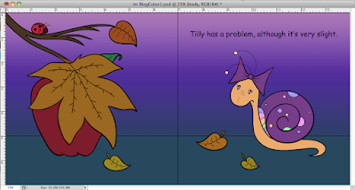
I've been away from the blog for a while, but now I'm ready to pick up where I left off. In the last post, I showed a process video of how I shaded and highlighted my drawings. Once all of my pages were completely colored, I added a few shadows with the pen and shape tools. Also some extra little effects here and there that I felt were needed. Then it was time to prepare my illustrations for
Blurb. First, I decide to test print a few pages to see how the color would look. My images were printing much darker than they appeared on screen. Thankfully, I went to the
Blurb website and found a way to help improve the color. I downloaded their Blurb ICC Profile. This way I could view my illustrations in Photoshop and have a more accurate idea of how they would look printed.
Here is a link to the Blurb ICC Profile:
Color Management Resource Center | Blurb
ICC Profile in Photoshop:
Once the ICC Profile was downloaded, I used color adjustments to change some of the colors. I created two new layers above all of my other layers. One for the color balance adjustment and the other for vibrance.
Here is a before and after:
(The changes look subtle, but it actually made a big difference.)
I then test printed a few pages and was happier with the color results. Now I was ready to prepare my files to create the book in Blurb.


